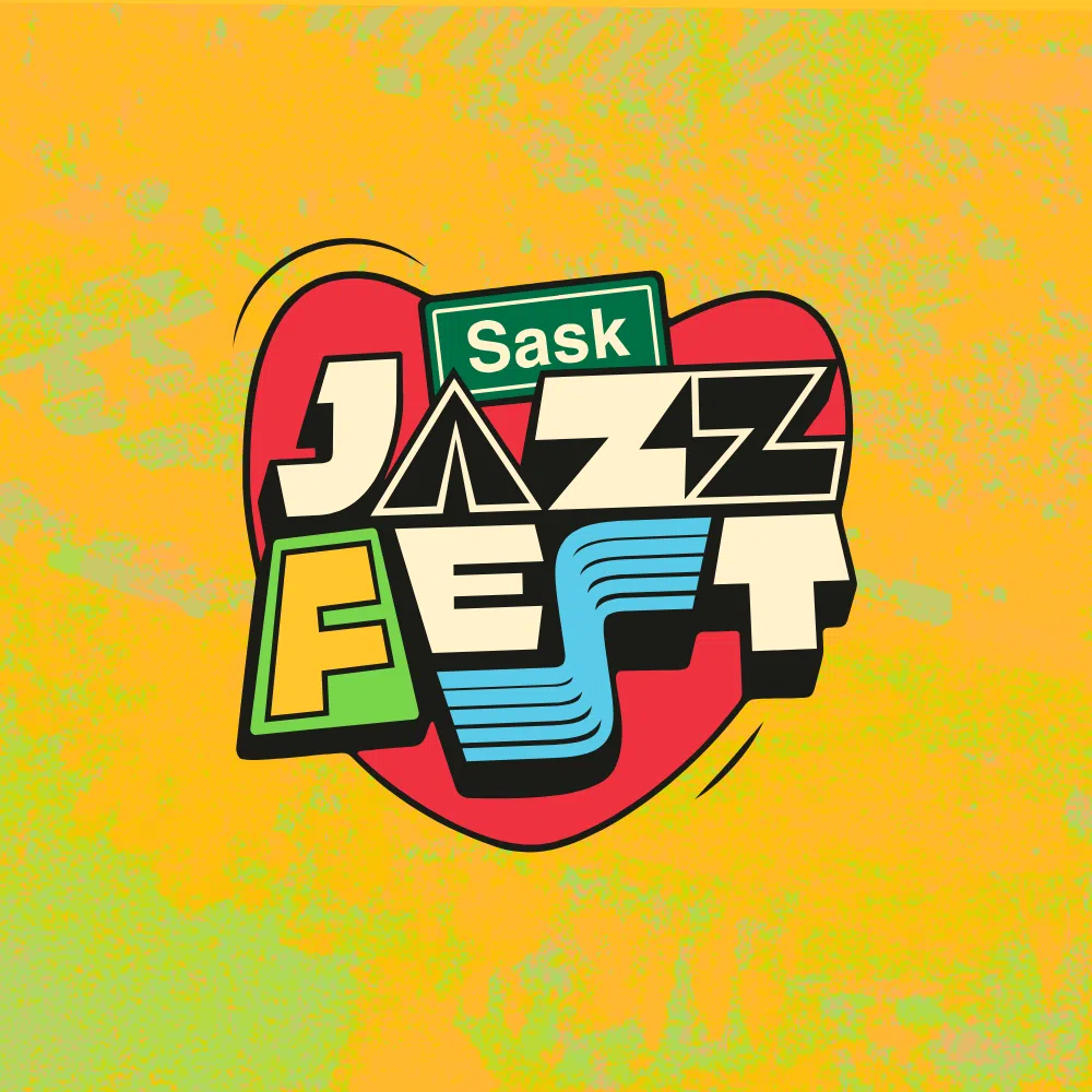
The Saskatchewan Jazz Festival has released their new brand identity, including an all new logo.
Executive Director Shannon Josdal, says the new look for the festival comes after the end of their title sponsorship deal with SaskTel.
“With them no longer the title. Every piece of signage, every piece of merchandise needed to be redone. We took this as an opportunity to do some market research, reach out to the community, and see what they had to say.”
Along with the new logo, Josdal says that the other changes made to this year’s Jazz Fest are also the result of feedback from the public.
“It’s a little bit of a shorter festival this year, which is actually something that the public told us they wanted to see. They wanted to see a more condense festival that they could get to.”
She adds that the logo is full of symbolism that represents both Saskatoon as well as Saskatchewan as a whole.
“You’ll see there’s a big heart that’s in it. That is meant to reference the Riversdale logo, which is the neighbourhood that Victoria Park is in, where we operate our main stage. The ‘A’ in ‘Jazz’ is a tipi, which is a reference to our place as treaty people here on Treaty 6 territory. The ‘S’ in ‘Fest’ is meant to represent the South Saskatchewan River, its also got a musical staff buried in it. The ‘F’ in ‘Fest’ is also shaped like the province of Saskatchewan, and the word ‘Sask’ is also in a Saskatchewan road sign.”
The Sask Jazz Fest will run this summer from July 5th to 11th.


